the Creative Commons Attribution 4.0 License.
the Creative Commons Attribution 4.0 License.
 | 10 Jun 2026
Interactive physical data cubes: A novel perspective for exploring Earth system dynamics
Maximilian Söchting
Miguel D. Mahecha
Earth system datasets continue to expand in size and complexity, making it increasingly difficult for non-experts to explore satellite observations and model outputs. We argue that new avenues for data exploration are needed to lower this barrier. Here we present the first interactive, touch-enabled physical data cube that allows users to explore any Earth system dataset intuitively across space, time, and variables. Exhibiting the physical data cube at a major conference showed that users could easily explore and identify patterns in atmospheric and land-surface data through direct physical interaction, demonstrating the system's potential for scientific discovery, education and public engagement.
- Article
(3685 KB) - Full-text XML
- BibTeX
- EndNote


Monitoring, modeling, and forecasting the Earth system rely on an ever-growing stream of spatially and temporally resolved data—from satellite observations to model outputs (Ustin and Middleton, 2021; Bauer et al., 2021). Such Earth system data are getting increasingly larger, higher-dimensional and complex. Many of these data, in particular outputs of Earth system models and regional to global Earth observation products, are based on regular grids in space and time. Higher dimensions of these arrays may correspond to multiple variables or model ensemble versions. Such data are increasingly stored as so called analysis-ready-data-cubes (ARDCs), i.e., data organized along spatial, temporal, and thematically gridded dimensions (Nativi et al., 2017; Giuliani et al., 2019; Mahecha et al., 2020; Montero et al., 2025). Paired with cloud-native file formats, they enable efficient querying of large spatiotemporal datasets.
However, as Earth system datasets grow in size and dimensionality, scientific analysis, data processing and visualization become more challenging (Sudmanns et al., 2020; Vance et al., 2024). Capable visualization tools for exploring large Earth system datasets are crucial for scientists to still be able to easily access and intuitively understand such data (Ware, 2013). To address these challenges, we previously developed https://www.lexcube.org (last access: 17 March 2026), a web-based visualization tool for data cubes (see Fig. 1; Söchting et al., 2023), and Lexcube for Jupyter Notebooks, an open-source Python package (https://github.com/msoechting/lexcube, last access: 17 March 2026), that allows intuitive exploration of data cubes as part of scientific workflows (Söchting et al., 2025). These developments enable users to interact with their data visualized as three-dimensional cubes in a virtual environment, where the side faces display dynamically changing Hovmöller diagrams (Hovmöller, 1949) to reveal spatiotemporal patterns. This setup enables rapid assessment of data quality and structure, making spatial or temporal gaps, anomalies, and artifacts immediately visible. Key insights, such as the presence of unexpected patterns, can thus be identified early in the analytic workflows or be effectively communicated to students or the general public.
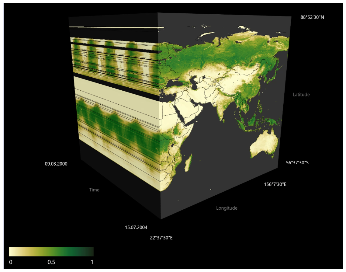
Figure 1Visualization of a spatiotemporal remote sensing record of a vegetation greenness indicator (kNDVI; Camps-Valls et al., 2021) from MODIS using our previously developed web-based data cube viewer https://www.lexcube.org (Söchting et al., 2023).
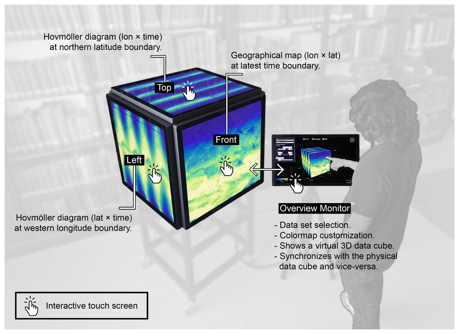
Figure 2Conceptual overview of the interactive physical data cube. As the user modifies the selection, the front side of the cube shows a geographical map at the latest time boundary, the left side shows a Hovmöller diagram (lat x time) at the western longitude boundary and the top side shows a Hovmöller diagram (lon x time) at the northern latitude boundary. Not depicted: the back side shows a geographical map at the oldest time boundary and the right side shows a Hovmöller diagram (lat x time) at the eastern longitude boundary. The bottom side is left out for easier construction. The separate overview monitor shows a virtual 3D data cube which is synchronized in every interaction with the physical data cube. All surfaces are touch-enabled, allowing pan and pinch touch gestures to modify the selection. Visualized variable: Surface Net Solar Radiation from the ERA5 reanalysis (Hersbach et al., 2020), via the Earth System Data Cube v3.0.2 (Mahecha et al., 2020). Overlaid: Natural Earth administrative region boundaries.
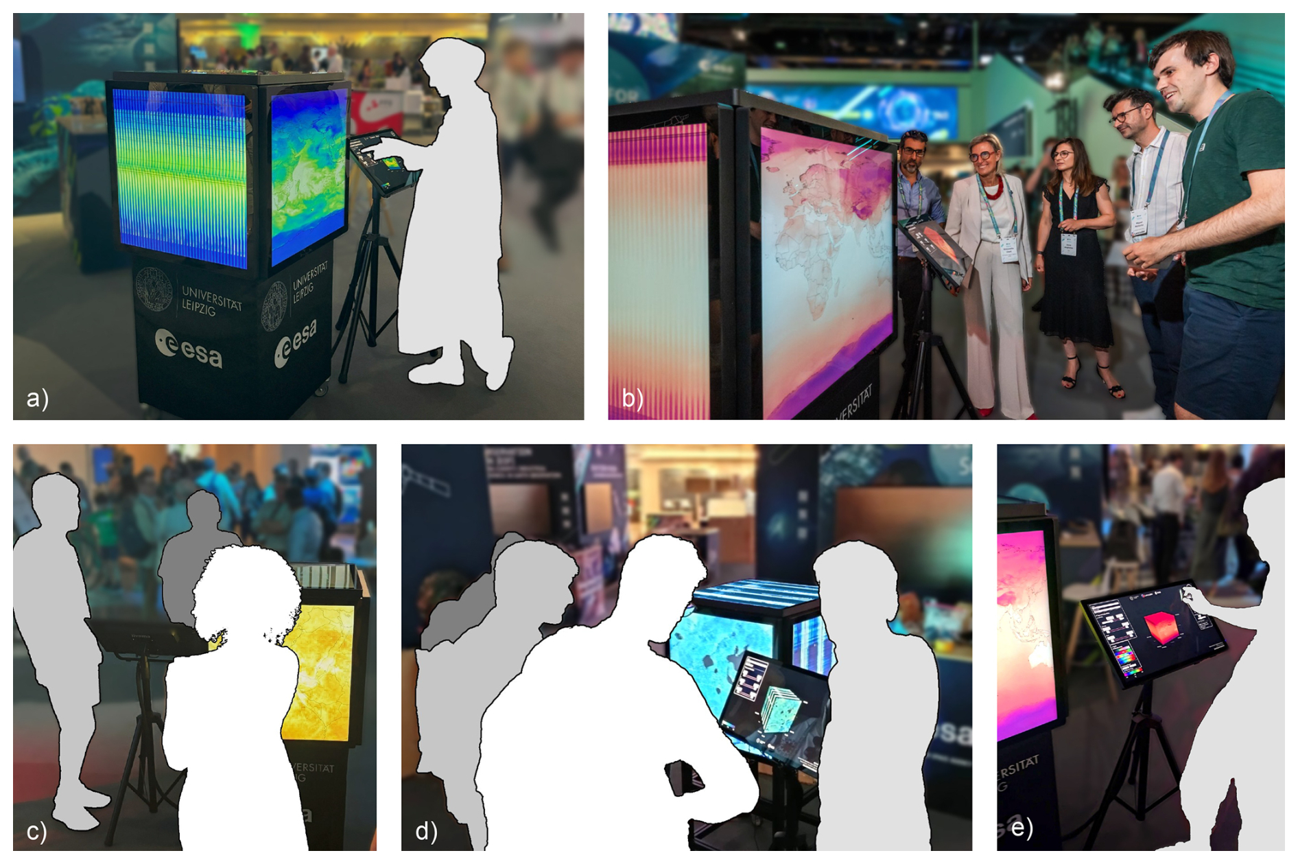
Figure 3The interactive physical data cube as exhibited at the ESA Living Planet Symposium in June 2025 in Vienna, Austria. a), c), d), e): Visitors interacting with the interactive physical data cube. b): Inauguration ceremony with Diego Fernàndez Prieto (Head of the Research and Development Section, ESRIN, ESA), Simonetta Cheli (Director of Earth Observation Programmes and Head of ESRIN, ESA), Anca Anghelea (Open Science Platforms Engineer, coordinating the project DeepESDL funding this work, ESA), Miguel Mahecha (co-author), Maximilian Söchting (co-author), from left to right. Photo credit b): ESA/J.Mai.
Map-based tools, i.e., two-dimensional visualizations, completely lack an intuitive view on spatiotemporal dynamics as they show only data at single points in time at once. There, the only visualization of temporal dynamics specifically happens with animations, which however have been shown in other fields to be less effective at communicating information than static depictions of the same data (Robertson et al., 2008). 3D data cube visualization tools like Lexcube offer this static and interactive view on temporal dynamics through the Hovmöller diagrams on the side faces, in addition to animations through time. However, limited to regular two-dimensional computer displays, Lexcube renders the 3D data cube onto a 2D screen, which may present navigation and orientation issues to users and hinder intuitive understanding. In order to have a truly intuitive three-dimensional interaction and understanding, the interactive device needs to have a three-dimensional form, e.g., in the form of a physical installation.
While interactive physical installations featuring Earth observation data and model outputs exist, e.g., in NASA's Earth Information Center1 (Washington D.C., USA) or ESA’s Φ-Experience2 (Frascati, Italy), they are typically serving curated data subsets and presented either on physical (interactive) globes or two-dimensional surfaces, not effectively communicating spatiotemporal dynamics beyond simple animations. This is why we propose the first interactive touch-enabled physical data cube that correctly expresses the intrinsic dimensions of Earth system data cubes. The cube allows users to explore any gridded ARDC stored in a cloud-native data format and intuitively investigate spatiotemporal patterns, effectively physicalizing Earth system data cubes (Jansen et al., 2015; Jofre et al., 2016)—enabling a broader accessibility and encouraging collaboration compared to screen-based visualizations. Taking form as a physical cube allows a more intuitive interface than the previous data cube visualization in Lexcube, since no orientation and navigation in a virtual 3D environment is needed; instead the data cube is actually there in physical space. As mentioned by Jansen et al. (2015), such a physical representation allows to leverage our “active perception skills” by walking around it and forming an understanding based on our natural perception. They further mention potential benefits for education use cases and the advantage of physicalized data exhibits bringing data into new contexts, allowing for “casual visualization”, as well as use in museums and art galleries.
Physical and digital globes follow a geometry-first paradigm: starting from Earths spherical geometry, contextual information is overlaid, either static snapshots or animated through time. By contrast, the physical data cube follows a data-first paradigm, as it physicalizes the intrinsic array shape of gridded Earth system data (space × time × variable) and makes this structure tangible. This allows easier understanding of spatiotemporal dynamics, because the coordinated faces of the cube provide persistent, simultaneously accessible views of both “state” (maps) and “change” (time-space cross sections, i.e., Hovmöller diagrams), rather than focusing on “state” and only showing “change” through animations. To help users first understand the side faces being Hovmöller diagrams and grasp the data cube visualization, we found showing an animation of precipitation data to be highly effective, as the high-variance, visually very distinct patterns on the front face effectively “draw their way through time” on the side faces as the data cube is animated through time, enabling the mental transfer needed to initially understand the connection between front and side faces.
The interactive physical data cube has five square touch-enabled screens, representing five of the six sides of the virtual data cube (see Fig. 2). The bottom side is left out for easier construction and improved air circulation. To guide users and allow advanced operations, there is a separate overview monitor mounted on a tripod stand. It shows a virtual 3D data cube, which is synchronized to the physical data cube, to give an overview in an interface similar to our previously developed software at https://www.lexcube.org. The monitor also shows meta data and the currently selected cube boundaries to help users understand what each cube side is currently visualizing. Furthermore, it is also possible to switch the currently visible dataset, make a precise data selection with sliders, play an animation through any dimension as well as adjust the colormap. See also the attached supplementary video file for a video demonstration of the physical data cube and its possible interactions.
On the software side, the interactive data cube uses existing software components from our previous work on https://www.lexcube.org. Inside of the physical data cube, there is a single PC connected to all five cube screens and the overview monitor, with one video output and one USB touch connection each. The PC is running a single Lexcube visualization server as well as multiple Lexcube visualization clients, one for each screen. All five clients synchronize in regards to any interaction or selection being made, achieving the effect of an interactive data cube as all five screens show the same virtual data cube from different angles. To automatically restore this setup whenever the PC is booted, an auxiliary Python script starts all software components and arranges them on the multiple displays correctly, making the interactive physical cube ”plug-and-play” with just a single power cable. The server component pre-processes all ingested datasets into tiles ahead of time. These tiles contain 2D slices of the original data, indexed in all three dimensions, and are available at different levels-of-detail to connected clients. For demonstration purposes, five different Earth system data cubes with over 200 parameters in total from various domains and data sources are accessible. This includes spectral indices from Sentinel-2 as well as data products from the ESA Climate Change Initiative (ESA CCI), the ERA5 and CAMS EAC4 reanalyses by the European Centre for Medium-Range Weather Forecasts (ECMWF) (Hersbach et al., 2020; Inness et al., 2019), the Global Land Evaporation Amsterdam Model (GLEAM) (Miralles et al., 2011) and FLUXCOM (Jung et al., 2019) – partially aggregated via the Earth System Data Cube (Mahecha et al., 2020) dataset. In practice, any gridded ARDC stored in a cloud-native data format such as Zarr (https://zarr.dev, last access: 17 March 2026) can be ingested into the system, as long as there is enough disk space in the magnitude of the original dataset size for the saved tiles. See the prior work on https://www.lexcube.org on more details on tiling and the pre-processing algorithm (Söchting et al., 2023). For all applicable parameters that have multiple years of data, anomalies, i.e., deviations from the mean seasonal cycle, can also be visualized instead of absolute values.
We exhibited the interactive data cube at the Living Planet Symposium 2025 conference held by the European Space Agency (ESA) in Vienna, Austria, during 23–27 June 2025 (see Fig. 3). The cube was accessible in a central location in the exhibition space during the whole conference. On the cube, the data sets demonstrated in Table 1 in Söchting et al. (2023) were available to explore, amongst others. While we personally interacted with approximately 150 attendees at the cube over the week, many more used it on their own without further guidance. Overall, the feedback was very positive and participants noted that the physical data cube makes the concept of a spatiotemporal data cube immediately clear. With accessible examples such as precipitation and air temperature, the side faces of the cube – effectively interactive Hovmöller diagrams – were generally easily understood, allowing users to then explore typically less widely known Earth surface dynamics such as land-surface energy fluxes and soil moisture dynamics. Next to the increased understanding, users also remarked that the interaction with the cube and the data presented to be very intuitive. This is most likely because the three-dimensional data is presented as such in the real world instead of being projected onto a two-dimensional computer screen. Users particularly noted the fast interaction and responsiveness of the system. Built using the Lexcube software, the interaction speed is effectively in the same order of magnitude (tens to hundreds of milliseconds) as the https://www.lexcube.org benchmarks (Söchting et al., 2023), and in practice even faster since no network transmission is involved, as all data is hosted locally. Notably, one user discovered a new spatiotemporal pattern in ECMWF aerosol data they had already worked with for years. Furthermore, users enjoyed the playful, social experience of having various large Earth system datasets accessible and explorable in physical space while discussing visible patterns with colleagues.
We conclude that the interactive physical data cube is an effective tool for exploring and visualizing Earth observation data and model outputs for scientific analysis and scientific communication. The data cube intuitively conveys to scientists, students and the broader public how spatiotemporal Earth system data in particular appears and behaves. We see great potential for using the interactive data cube in education, as interactive visualizations have been shown to increase engagement (Cervenec et al., 2022). While we have not yet systematically evaluated the physical data cube for teaching, we anticipate high value particularly in secondary education, where geography instruction still often emphasizes static, atlas-style content and neglects temporal dynamics. Yet, understanding seasonality, trends, and variability is essential for grasping the dynamic nature of the Earth system. Having discussed phenomenons visible and explorable in a physical exhibit allows for deeper engagement and a playful learning environment. Furthermore, the data cube can be exhibited at outreach events or in natural science museums, offering an accessible and playful way of exploring and interacting with Earth system data without any technical knowledge required. For scientists, the physical cube allows to inspect spatiotemporal patterns even more intuitively than previously possible with digital-only tools, enabling a deeper understanding of existing data sets they might already know and use in their research. Extending the current feature set of the physical data cube with analytical tools beyond pure visualization and integrating it deeper into scientific workflows, e.g., to easily visualize in-progress data sets, possibly from running computations, execute analyses, visualize single time series and compute statistical measures, would further strengthen the scientific use case.
A limitation of the proposed interface is that, while many Earth system datasets are gridded arrays and are therefore correctly displayed in the shape of a cube, the Earth itself is not a cube. Therefore, for visualizing global data, displaying them on the planar surfaces of a cube will necessarily introduce distortions. In practice, this means the poles are visually exaggerated, while the area around the equator is under-exaggerated. Scaling the visualized data along latitude to correspond to an equal-area projection could mitigate this issue partially. As the tool focuses on raster array data, non-gridded, sparse or vector data cannot be sensibly visualized. However, a simple vector data overlay showing region boundaries is implemented. Furthermore, the Hovmöller diagrams on the side faces, being orthogonal to the map view of the front and back faces, capture a lot of spatiotemporal dynamics, but may miss phenomena along curved paths, e.g., along coastlines. For this, a voxel visualization allowing arbitrary shapes rather than having a fixed cube shape with orthogonal boundaries would be highly beneficial.
While digital data exploration tools such as https://www.lexcube.org are inherently more accessible than physical cubes requiring construction resources or physical access, physicalizing Earth observation data and model outputs offers significant potential for scientific communication and education. We estimate that physicalizations and tools for intuitively exploring such data sets without technical knowledge will be highly relevant in the future as the amount of available data grows exponentially, e.g., with the Digital Twin initiatives. As the societal importance of Earth system datasets increases and informs policy decisions, e.g., in the biodiversity context via GEO BON (Griffith et al., 2026), such data visualization tools can transparently and effectively communicate the underlying observed or modeled Earth system data, e.g., global climate projections or spatiotemporal development of essential biodiversity variables, to the general public. We believe that making petabyte-scale data easily available through physical visualizations will be crucial in scientific knowledge gain and science communication. We see further applications across disciplines in Earth sciences dealing with high-resolution, three-dimensional, simulated or recorded data, with possibilities of extending the physicalization to more dimensions beyond spatiotemporal data such as pressure, frequency or height/depth.
The five monitors used for the cube display are industrial made-to-order 33-inch square screens with a screen resolution of 1920×1920 and touch functionality. The overview monitor is a commercially available 1920×1080 touch monitor (iiyama ProLite T2455MSC-B1). The PC deployed in our prototype has the following specifications: Intel Core Ultra 7 265 K CPU, an NVIDIA RTX 5070 Ti GPU with 16 GB of VRAM, Samsung 990 Pro NVMe SSD, Microsoft Windows 11. This setup has been proven to offer very low latency, although similar performance can probably be achieved with slightly lower specs. No benchmarking with different components has been done, but from the software architecture and hardware design of the cube, we believe the GPU and SSD are the most critical components for low latency. Since the GPU provides rendering and video output to six displays (equaling 20 megapixels = two and a half 4 K displays), downgrading to 8 GB of VRAM or less, or a much less capable GPU in general, might severely impact performance.
The software used in the interactive physical data cube builds on the previously published open-source Lexcube package (Söchting et al., 2023, 2025), which is openly available on Github (https://github.com/msoechting/lexcube, last access: 17 March 2026) and on Zenodo (https://doi.org/10.5281/zenodo.12699659, Söchting, 2026). The physical data cube also uses additional code developed specifically for this use case, including adaptations for the particular hardware of our prototype. Because this code is tightly coupled to specific hardware and is not intended as a reusable general-purpose software package, it is not publicly released. The open-source Lexcube components remain fully available under their original license (GPLv3), and the manuscript describes the installation-specific functionality in sufficient detail to support understanding and reproduction of the presented concepts.
Data visualized in our prototype includes the Earth System Data Cube (https://doi.org/10.5194/esd-11-201-2020, Mahecha et al., 2020), the ECMWF EAC4 CAMS Global Reanalysis (https://doi.org/10.24381/d58bbf47, Copernicus Atmosphere Monitoring Service, 2020), and Sentinel-2 data.
A video demonstration of the interactive physical data cube can be found here https://doi.org/10.5446/73082 (Söchting and Mahecha, 2026).
M. Söchting: Conceptualization, Methodology, Investigation, Software, Visualization, Writing – original draft, Writing – review and editing. M. Mahecha: Writing – review and editing, Funding acquisition, Supervision.
The contact author has declared that neither of the authors has any competing interests.
Samsung Galaxy AI (One UI 8.0) has been used to extend the library background of Fig. 2. Claude Sonnet 4.5 has been used to improve the language in parts of the text, however all intellectual work and writing has been performed by the authors. After using the tools, the authors reviewed and edited the content as needed and take full responsibility for the content of the publication.
Publisher's note: Copernicus Publications remains neutral with regard to jurisdictional claims made in the text, published maps, institutional affiliations, or any other geographical representation in this paper. The authors bear the ultimate responsibility for providing appropriate place names. Views expressed in the text are those of the authors and do not necessarily reflect the views of the publisher.
The authors thank Anca Anghelea and Diego Fernàndez Prieto for the support in making the physical data cube possible, as well as Brockmann Consult and especially Gunnar Brandt for the logistical support. The authors further thank Sophie Wolf for providing feedback on the conceptual overview figure.
This research and the material costs for the physical data cube were funded by the European Space Agency (ESA) via the Deep ESDL project (contract no. 4000137643/22/I-AG). This work was further supported by the NFDI4Earth pilot projects of the German Science Foundation under the Grant 460036893; and BELSPO via the HERMES Project under the Grant SR/02/402.
Supported by the Open Access Publishing Fund
of Leipzig University.
This paper was edited by Anping Chen and reviewed by Miguel-Ángel Fernández-Torres and one anonymous referee.
Bauer, P., Dueben, P. D., Hoefler, T., Quintino, T., Schulthess, T. C., and Wedi, N. P.: The digital revolution of Earth-system science, Nat. Comput. Sci., 1, 104–113, https://doi.org/10.1038/s43588-021-00023-0, 2021. a
Camps-Valls, G., Campos-Taberner, M., Moreno-Martínez, Á., Walther, S., Duveiller, G., Cescatti, A., Mahecha, M. D., Muñoz-Marí, J., García-Haro, F. J., Guanter, L., Jung, M., Gamon, J. A., Reichstein, M., and Running, S. W.: A unified vegetation index for quantifying the terrestrial biosphere, Sci. Adv., 7, eabc7447, https://doi.org/10.1126/sciadv.abc7447, 2021. a
Copernicus Atmosphere Monitoring Service: CAMS global reanalysis (EAC4), Copernicus Atmosphere Monitoring Service (CAMS) Atmosphere Data Store [data set], https://doi.org/10.24381/d58bbf47, 2020. a
Cervenec, J., Fox, J., Peggau, K., Wilson, A. B., Li, B., Hu, D., Chang, R., Wong, J., and Bossley, C.: Interactive data visualizations of Earth’s atmosphere: Effects on student engagement and perceived learning, J. Geosci. Educat., 70, 517–529, https://doi.org/10.1080/10899995.2022.2038963, 2022. a
Giuliani, G., Masó, J., Mazzetti, P., Nativi, S., and Zabala, A.: Paving the way to increased interoperability of earth observations data cubes, Data, 4, 113, https://doi.org/10.3390/data4030113, 2019. a
Griffith, J., Lord, J.-M., Catchen, M. D., Arce-Plata, M. I., Blanchet, F. G., Chandramohan, M., Diaz-Corzo, M. C., Gravel, D., Gutiérrez, C., Helfenstein, I. S., Hoban, S., Kass, J. M., Laikre, L., Larocque, G., Leigh, D. M., Leung, B., Mastretta-Yanes, A., Millette, K. L., Berbeo, M. A. M., Nguyen, D., Norman, K. E., Olaya-Rodríguez, M. H., Pahls, S., Pereira, K., Peres-Neto, P. R., Poisot, T., Pollock, L. J., Rey-Velasco, J. C., Rincon-Parra, V. J., Roeoesli, C., Rousseu, F., Sánchez-Clavijo, L. M., Schuman, M. C., Selmoni, O., da Silva, J. M., Suarez-Valencia, E., Surasinghe, T. D., Turak, E., Urbina, L. F., Valentin, S., Wightman, N., Zuloaga, J., Londoño, M. C., and Gonzalez, A.: BON in a Box: An Open and Collaborative Platform for Biodiversity Monitoring, Indicator Calculation, and Reporting, BioScience, 76, 345–358, https://doi.org/10.1093/biosci/biaf189, 2026. a
Hersbach, H., Bell, B., Berrisford, P., Hirahara, S., Horányi, A., Muñoz-Sabater, J., Nicolas, J., Peubey, C., Radu, R., Schepers, D., Simmons, A., Soci, C., Abdalla, S., Abellan, X., Balsamo, G., Bechtold, P., Biavati, G., Bidlot, J., Bonavita, M., De Chiara, G., Dahlgren, P., Dee, D., Diamantakis, M., Dragani, R., Flemming, J., Forbes, R., Fuentes, M., Geer, A., Haimberger, L., Healy, S., Hogan, R. J., Hólm, E., Janisková, M., Keeley, S., Laloyaux, P., Lopez, P., Lupu, C., Radnoti, G., de Rosnay, P., Rozum, I., Vamborg, F., Villaume, S., and Thépaut, J.-N.: The ERA5 global reanalysis, Q. J. Roy. Meteorol. Soc., 146, 1999–2049, https://doi.org/10.1002/qj.3803, 2020. a, b
Hovmöller, E.: The Trough-and-Ridge diagram, Tellus, 1, 62–66, https://doi.org/10.1111/j.2153-3490.1949.tb01260.x, 1949. a
Inness, A., Ades, M., Agustí-Panareda, A., Barré, J., Benedictow, A., Blechschmidt, A.-M., Dominguez, J. J., Engelen, R., Eskes, H., Flemming, J., Huijnen, V., Jones, L., Kipling, Z., Massart, S., Parrington, M., Peuch, V.-H., Razinger, M., Remy, S., Schulz, M., and Suttie, M.: The CAMS reanalysis of atmospheric composition, Atmos. Chem. Phys., 19, 3515–3556, https://doi.org/10.5194/acp-19-3515-2019, 2019. a
Jansen, Y., Dragicevic, P., Isenberg, P., Alexander, J., Karnik, A., Kildal, J., Subramanian, S., and Hornbæk, K.: Opportunities and Challenges for Data Physicalization, in: Proceedings of the 33rd Annual ACM Conference on Human Factors in Computing Systems, CHI '15, 3227–3236, Association for Computing Machinery, New York, NY, USA, ISBN 9781450331456, https://doi.org/10.1145/2702123.2702180, 2015. a, b
Jofre, A., Szigeti, S., and Diamond, S.: Materializing data: Notes on collaboration and tangible interfaces with excerpts and additions, DAT Journal, 1, 2–14, https://doi.org/10.29147/2526-1789.DAT.2016v1i2p2-14, 2016. a
Jung, M., Koirala, S., Weber, U., Ichii, K., Gans, F., Camps-Valls, G., Papale, D., Schwalm, C., Tramontana, G., and Reichstein, M.: The FLUXCOM ensemble of global land-atmosphere energy fluxes, Sci. Data, 6, 74, https://doi.org/10.1038/s41597-019-0076-8, 2019. a
Mahecha, M. D., Gans, F., Brandt, G., Christiansen, R., Cornell, S. E., Fomferra, N., Kraemer, G., Peters, J., Bodesheim, P., Camps-Valls, G., Donges, J. F., Dorigo, W., Estupinan-Suarez, L. M., Gutierrez-Velez, V. H., Gutwin, M., Jung, M., Londoño, M. C., Miralles, D. G., Papastefanou, P., and Reichstein, M.: Earth System Data Cubes Unravel Global Multivariate Dynamics, Earth Syst. Dynam., 11, 201–234, https://doi.org/10.5194/esd-11-201-2020, 2020. a, b, c, d
Miralles, D. G., Holmes, T. R. H., De Jeu, R. A. M., Gash, J. H., Meesters, A. G. C. A., and Dolman, A. J.: Global land-surface evaporation estimated from satellite-based observations, Hydrol. Earth Syst. Sci., 15, 453–469, https://doi.org/10.5194/hess-15-453-2011, 2011. a
Montero, D., Kraemer, G., Anghelea, A., Aybar, C., Brandt, G., Camps-Valls, G., Cremer, F., Flik, I., Gans, F., Habershon, S., Ji, C., Kattenborn, T., Martínez-Ferrer, L., Martinuzzi, F., Reinhardt, M., Söchting, M., Teber, K., and Mahecha, M. D.: Earth System Data Cubes: Avenues for advancing Earth system research, Environ. Data Sci., 3, e27, https://doi.org/10.1017/eds.2024.22, 2025. a
Nativi, S., Mazzetti, P., and Craglia, M.: A view-based model of data-cube to support big earth data systems interoperability, Big Earth Data, 1, 75–99, 2017. a
Robertson, G., Fernandez, R., Fisher, D., Lee, B., and Stasko, J.: Effectiveness of Animation in Trend Visualization, IEEE T. Vis. Comput. Gr., 14, 1325–1332, https://doi.org/10.1109/TVCG.2008.125, 2008. a
Söchting, M.: msoechting/lexcube: v2.0.1 (v2.0.1), Zenodo [code], https://doi.org/10.5281/zenodo.20304813, 2026. a
Söchting, M. and Mahecha, M. D.: Interactive physical data cubes: A novel perspective for exploring Earth system dynamics, TIB AV Portal [video], https://doi.org/10.5446/73082, 2026. a
Söchting, M., Mahecha, M. D., Montero, D., and Scheuermann, G.: Lexcube: Interactive Visualization of Large Earth System Data Cubes, IEEE Comput. Graph., 44, 25–37, https://doi.org/10.1109/mcg.2023.3321989, 2023. a, b, c, d, e, f
Söchting, M., Scheuermann, G., Montero, D., and Mahecha, M. D.: Interactive Earth system data cube visualization in Jupyter notebooks, Big Earth Data, 1–15, https://doi.org/10.1080/20964471.2025.2471646, 2025. a, b
Sudmanns, M., Tiede, D., Lang, S., Bergstedt, H., Trost, G., Augustin, H., Baraldi, A., and Blaschke, T.: Big Earth data: disruptive changes in Earth observation data management and analysis?, Int. J. Digit. Earth, 13, 832–850, https://doi.org/10.1080/17538947.2019.1585976, 2020. a
Ustin, S. L. and Middleton, E. M.: Current and near-term advances in Earth observation for ecological applications, Ecol. Process., 10, https://doi.org/10.1186/s13717-020-00255-4, 2021. a
Vance, T. C., Huang, T., and Butler, K. A.: Big data in Earth science: Emerging practice and promise, Science, 383, https://doi.org/10.1126/science.adh9607, 2024. a
Ware, C. (Ed.): Information Visualization (Third Edition), Interactive Technologies, Morgan Kaufmann, Boston, 3rd Edn., ISBN 978-0-12-381464-7, https://doi.org/10.1016/C2009-0-62432-6, 2013. a