the Creative Commons Attribution 4.0 License.
the Creative Commons Attribution 4.0 License.
 | 26 Aug 2024
Cautionary remarks on the planetary boundary visualisation
Miguel D. Mahecha
Guido Kraemer
Fabio Crameri
The planetary boundary (PB) concept has captured attention across academia and the public alike. Its unique visual representation has been key to the development of the concept and its dissemination. In this commentary, we outline three areas of concern to facilitate further enhancement in the PB concept’s visualisation. First, the radial bar plot leads to a quadratic scaling of the effect sizes. Second, the colour gradations denoting the risk of each boundary transgression use complex non-linear patterns, which complicates interpretation. Third, non-linearly distorted colour scales and their fading make the visual perception for people suffering from colour-vision deficiency even more challenging or impossible. The conjunction of quadratic effect scaling and specific colour coding may unintentionally amplify the perception of high-risk areas. We recommend a careful revision of the visual language employed in PB communication. Addressing these concerns will make the PB visualisation a more accurate base for decision-makers.
- Article
(2156 KB) - Full-text XML
- BibTeX
- EndNote


Our planet faces multifaceted pressures, as corroborated by comprehensive reports like those from the Intergovernmental Panel on Climate Change (IPCC) for climate change and the Intergovernmental Science-Policy Platform on Biodiversity and Ecosystem Services (IPBES) for biodiversity change (IPBES, 2019; IPCC, 2023), encapsulating numerous additional human-induced Earth system changes. The planetary boundary (PB) concept (Rockström et al., 2009a, b) was designed as a framework that provides a unified perspective on the effects of altering various Earth system dimensions. It identifies thresholds, termed “planetary boundaries”, within which humans and other organisms can coexist sustainably, thus ensuring the preservation of Earth's vital life-support systems. With its clarity, the PB concept has emerged as a widely recognised tool for communicating the global change challenges of our era to decision-makers (Steffen et al., 2015). However, given its broad scope, it is not surprising that the PB concept has sparked debate and controversy (Montoya et al., 2018; Rockström et al., 2018; Biermann and Kim, 2020). In response, the PB concept has seen refinements. More recent interpretations address initial omissions of interactions among boundaries (addressed in Steffen et al., 2015) and the absence of spatial mapping (introduced in Richardson et al., 2023). The remaining critiques are summarised by Tandon (2023). However, our aim here is not to critique the PB concept; for that, we redirect readers to the pertinent literature. Instead, we shift our focus to another facet that has thus far remained unaddressed in the discussion: the visual language used to communicate the PB concept.
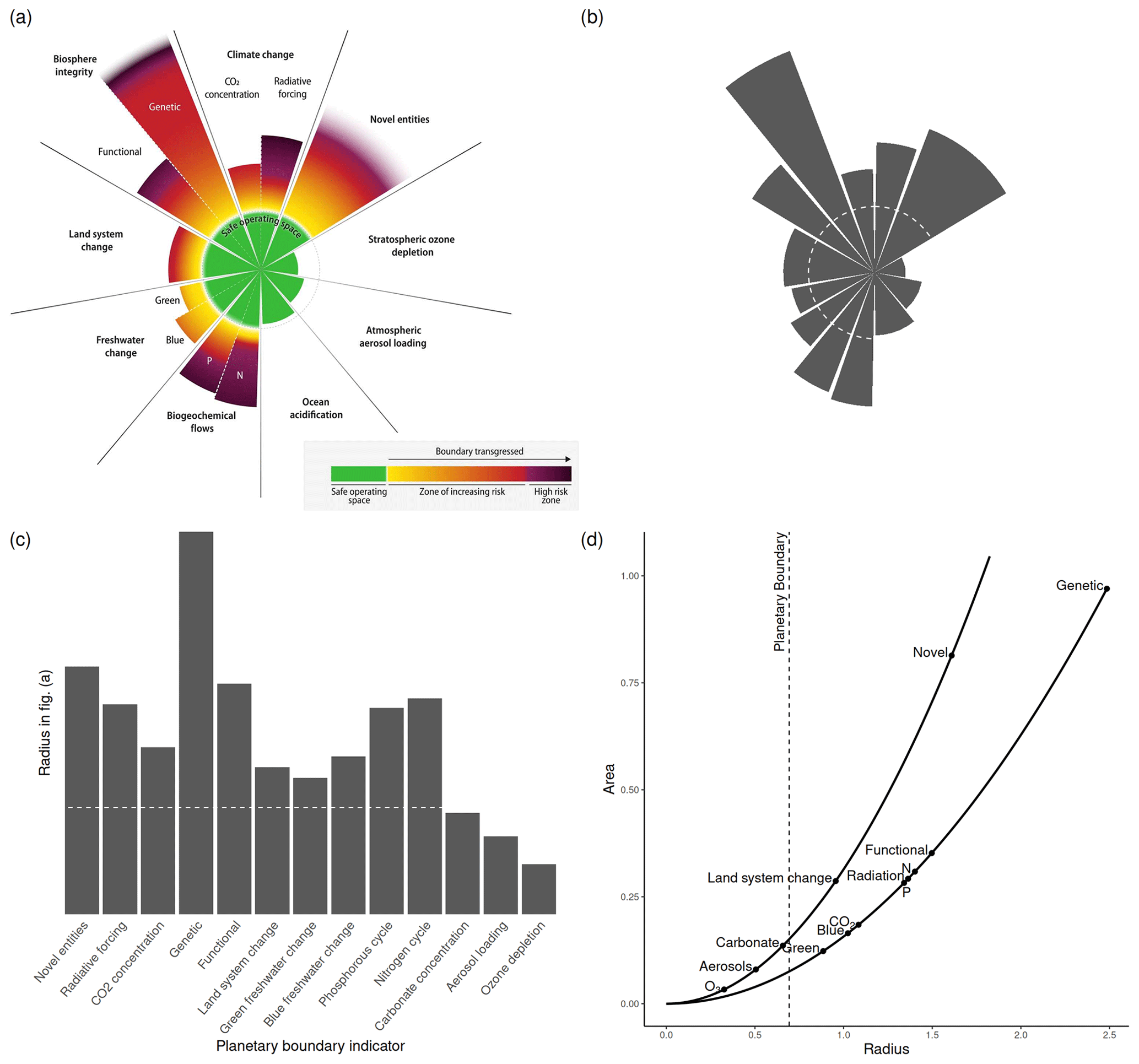
Figure 1Scaling issues inherent in the PB concept visualisation. (a) The latest representation of the planetary boundary concept as a radial bar plot, where indicators representing different boundaries are shown as wedges. The radius of the wedge represents the value of the indicator. Source: Richardson et al. (2023), extracted from the article PDF file, figure released under the Creative Commons Attribution NonCommercial License 4.0 CC BY-NC, https://creativecommons.org/licenses/by-nc/4.0/ (last access: 20 November 2023). (b) The area representation of the PBs as depicted in the original figure in (a). A small difference in the scaling is explained in the text. (c) Actual effect sizes as reported in Richardson et al. (2023). (d) Comparison of the reported PB values to the area shown. The scaling exhibits two distinct curves, as some PBs are divided into two segments. This leads to a halving of the value of the angle θ and respective area.
Since its inception, the PB concept has consistently featured a powerful visualisation. Geere (2020) recounts an intriguing backstory. The conceptual seed for the PB concept, as described by Geere, was sown by Bo Ekman, founder of the Tällberg Foundation. Ekman envisioned the Earth as a crucial stakeholder at every negotiation table. This figurative idea was then scientifically articulated by Johan Röckström and underpinned by the first PB figure in Rockström et al. (2009b). However, it was likely the version in Rockström et al. (2009a), heavily revised by Wesley Fernandes, an art director with Nature, that made a striking impact, as noted by Geere (2020). This figure employs a radial bar plot, with each wedge representing a different PB and the safe operating space marked by a constant radius. Morseletto (2017) conducted an in-depth analysis of this figure and concluded that it serves as a prime example of science communication, being understandable, meaningful, and engaging. This perception appears to be widely shared, as the figure has been reproduced and adapted extensively (e.g. Nash et al., 2017; Persson et al., 2022; Bachmann et al., 2023), and the concept has even been transferred to other branches of science, such as describing the dimensions of forest disturbance attributes (Turner and Seidl, 2023).
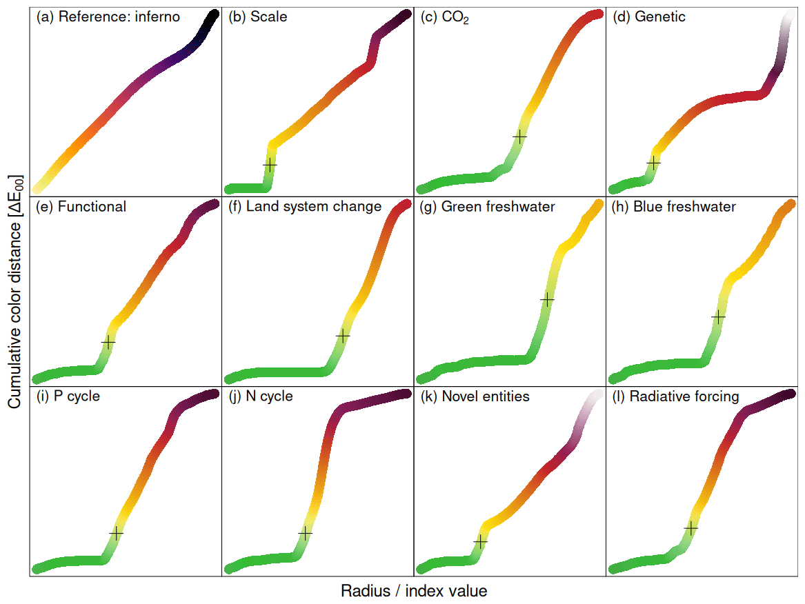
Figure 2The plots show the distance of the indicator along the transgression of the PB vs. the risk as shown as distance in perceptual colour space (CIEDE2000; Sharma et al., 2005; Sánchez Beeckman, 2021). (a) Colour map “inferno” as reference for a linear colour space. (b) We show the “Scale” of the colour map shown on the bottom of Fig. 1a. In panels (c) to (l), we show how the cumulative colour distance grows as a function of the change in the PB. Data have been extracted from Fig. 1a.
The most recent iteration by Richardson et al. (2023, as reproduced in Fig. 1a) introduces a substantial extension. It adds colour gradients intended to illustrate how the transgression of PBs translates into escalating risks. Also, this figure has been showcased and replicated by numerous global news outlets, achieving vast reach. At first glance, the figure seems to provide an intuitive visualisation of the core messages of the PB concept as interpreted by Morseletto (2017). However, we contend that the current graphical representation of the PB concept and its derivatives, though visually compelling, may inadvertently mislead its audience. Here, we scrutinise the visualisation techniques employed in the PB concept and discuss potential pitfalls and enhancements. Our aim is to initiate a discussion towards developing a visualisation strategy in which the visual language accurately conveys the underlying scientific concepts.
The figure in question (Fig. 1a) presents a radial alignment. In Fig. 1b, we recreate the latest figure presented in Richardson et al. (2023), by omitting the risk indicators that are depicted as colours. This variant focuses on the effect sizes, a unidimensional value – the distance to the centre. Tabular data of this kind would typically be represented as a bar chart, as illustrated in Fig. 1c. However, due to the radial configuration, the displayed area scales quadratically with the intended value of the variable:
where Ar is the area of the wedge, r is the radius (i.e., the value of the PB indicator variable), and θ is the angle of the wedge, as shown in Fig. 1c. The area of the wedge is perceived as visual weight, which can cause the visual impression conveyed by this plot to not accurately reflect the underlying data, a distortion effect well-documented in the scientific visualisation literature (see Spence and Krizel, 1994). In chapter 2 of their seminal work, “The Visual Display of Quantitative Information”, Tufte (2001) addresses the general problem of visualisations where the size of the effect scales differently in the visualisation compared to the data, advocating for representations where the size of the effect shown in graphics is proportional to the size of the effect in the data.
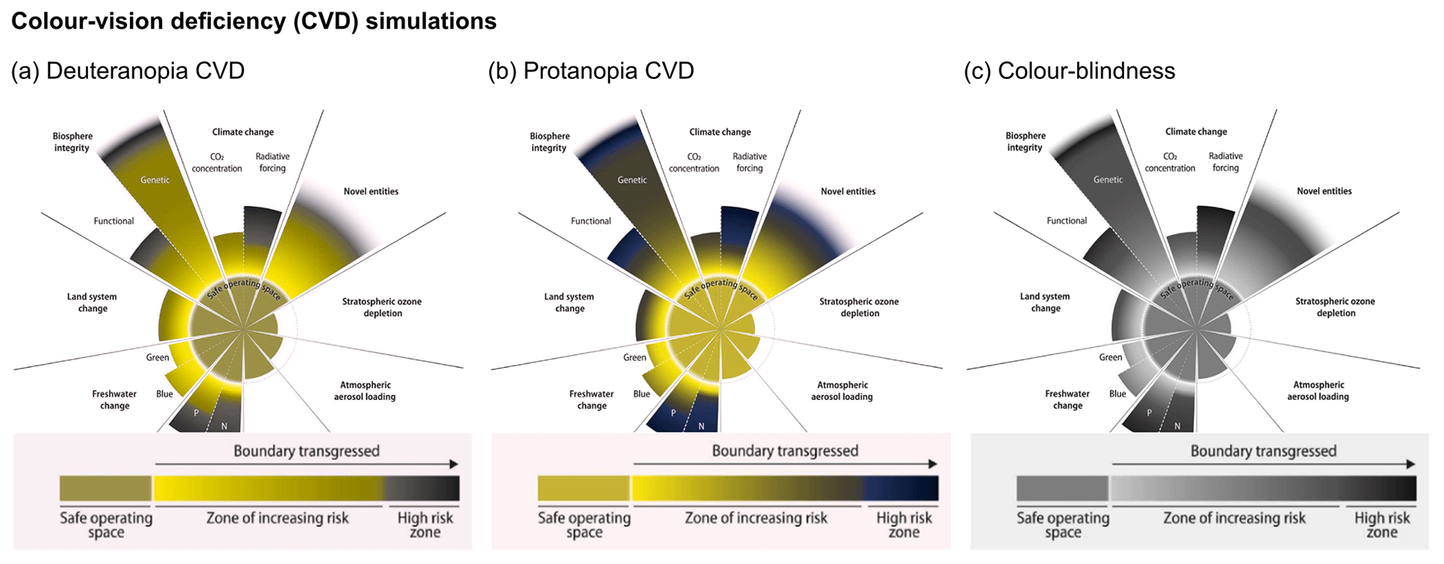
Figure 3Colour-vision deficiency simulations for (a) deuteranopia (green blindness), (b) protanopia (red blindness), and (c) full colour blindness after Brettel et al. (1997), outlining how the currently applied colour coding in the PB figure is inaccessible to some readers.
The fact that the scaling is a particular issue for radial bar plots, known by various names such as “radial bar chart”, “radar graph”, “nightingale glyph”, “rose diagram”, and “polar-area diagram”, is actually known since their inception by Florence Nightingale (Nightingale, 1858). Distinguished as a pioneer in statistical graphics (among other disciplines), Nightingale depicted deaths in British military hospitals during the Crimean War (1854–1856; Cohen, 1984; Brasseur, 2005). Aware of the inherent scaling challenges, she opted for the wedge area rather than the radius to represent the effect sizes of the data (Cohen, 1984), a choice that could indicate the way for an alternative approach to visualising the PB concept. However, the efficacy of radial charts is debatable. Waldner et al. (2019), for instance, shows that radial charts may be less intuitive for human interpretation compared to Cartesian coordinate systems, even for naturally cyclic patterns such as diurnal or seasonal events.
The PB figure (Fig. 1a) is colour-coded to show the risk associated with a transgressed PB. This method is reminiscent of the different assessment reports by the IPCC, where so-called “burning embers” visualise the risks from climate change for various aspects/sectors under different global warming scenarios. These burning embers have also generated considerable attention (for a review on their development, see Zommers et al., 2020) by indicating that certain levels of global warming lead to high-risk zones in specific sectors or impact domains. However, the representation of risks by the PB figure is notably more complex, which prompts the question: why is this the case?
The colour map employed is derived from Inferno (van der Walt and Smith, 2020). Inferno is a colour map that has been widely adopted and is considered an excellent choice for a continuous colour scale due to its visual uniformity (see Fig. 2a), meaning the perceived difference between colours is proportional to the difference in the values they represent (Crameri et al., 2020). In Fig. 2, we have extracted the colour gradients of the risks associated with the transgression of the PBs and displayed them against the value of the PB itself. To quantify this relationship, we have applied the following formula:
where r is the radius of the corresponding wedge in the PB visualisation by Richardson et al. (2023) as a scaling factor, x is the PB indicator variable, is the Holocene mean of the PB indicator variable, and xPB is the threshold defined as planetary boundary. This normalisation places the planetary boundary at log e(2) and the Holocene mean at 0.1 Values have been taken from Table 1 in Richardson et al. (2023).2 The y axis in Fig. 2 is the cumulative distance along the colour gradient in CIELAB2000 colour space (Sharma et al., 2005; Sánchez Beeckman, 2021).
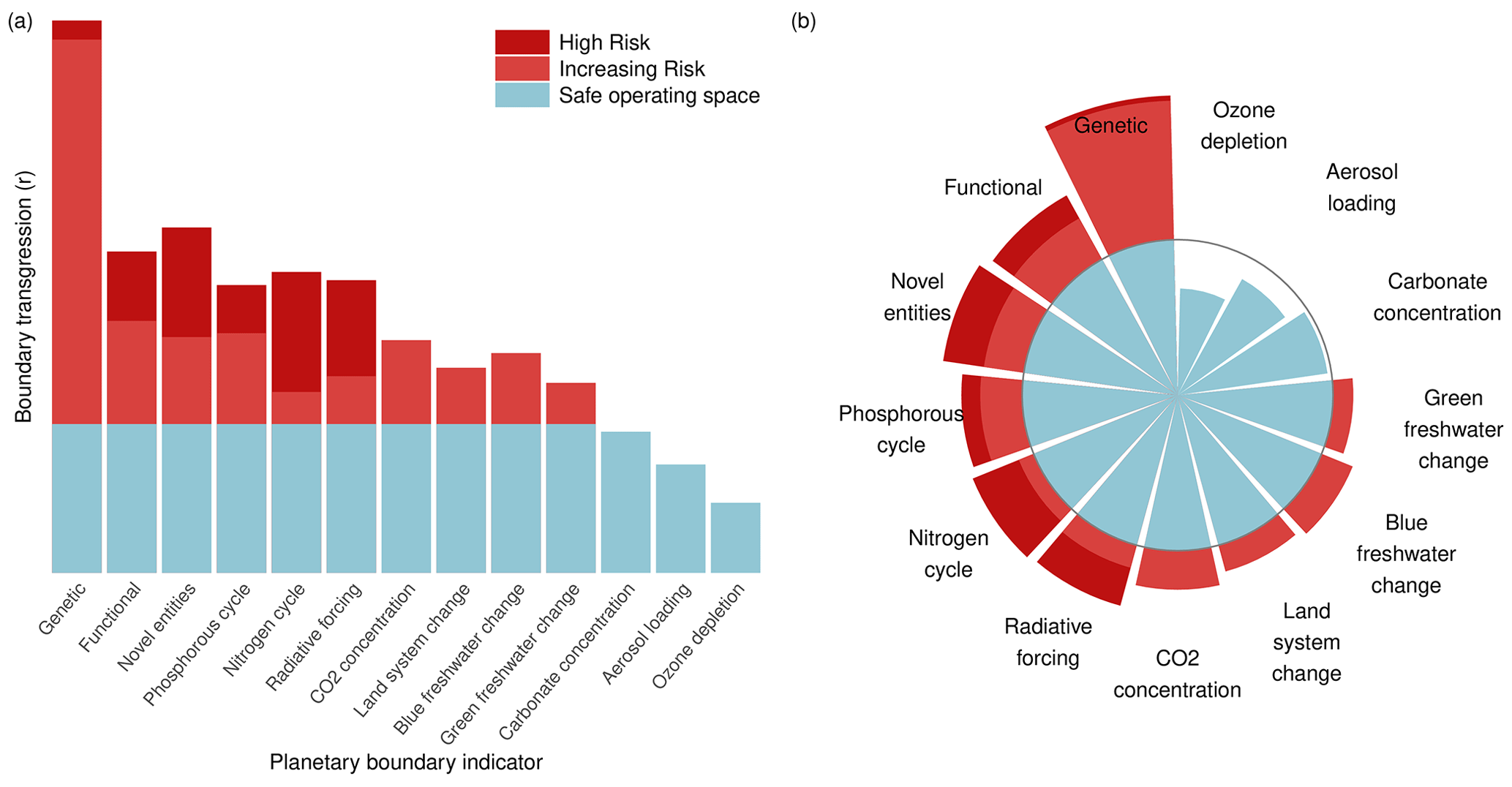
Figure 4Two approaches to alleviate the PB visualisation issues. (a) Translating the PB figure into Cartesian coordinates and choosing a discreet colour bar – visually unattractive but precise. The bars have been reorganised approximately by size. (b) Maintaining the circular bar chart but scaling the wedge area by the effect sizes of the underlying variable. Colours are discrete risk levels, and the colour scale has been changed to be accessible to readers with colour-vision deficiency (CVD).
Figure 2 shows that the risk scales for each PB in a very different manner, and the non-linearity of the scaling is not comparable. For instance, the PB “Biosphere integrity/Genetic” is the most overshot boundary and the one where the high-risk zone is furthest away, but the yellow–red gradient still shows mostly red and very little yellow (compare Figs. 1a and 2d). In the case of the PB “Biogeochemical flows/N”, the gradient is the one furthest in the purple high-risk zone, but the yellow–red gradient is mostly yellow (compare Figs. 1a and 2j). Moreover, the transition from red to purple on the colour scale is much more abrupt than anywhere else in the circular bar plot. Such variations in scaling are not clarified by Richardson et al. (2023). While we assume that the authors have quantified these transitions, we suggest that this form of visualising them is too subtle and does not allow the viewer to properly quantify the risk progression from the plot.
Another point that adds to the confusion is the seemingly arbitrary order of bars; in the burning embers diagrams, the bars are arranged according to the intensity of the associated risk, which provides a clear gradient of risk, thus facilitating a more straightforward visual interpretation. Conversely, the PB visualisation lacks this arrangement and uses a highly non-linear and less transparent scaling of risk, potentially complicating the visual interpretation.
Human colour vision varies among individuals. Most of the population has trichromacy, meaning they possesses three types of cone cells sensitive to long, medium, and short wavelengths of the visible spectrum. However, some individuals have fewer functioning types of cone cells, resulting in dichromacy or monochromacy. Trichromatic colour vision is understood well to the extent where perceptual colour spaces, such as CIEDE2000 (Sharma et al., 2005), have been created (as applied, for example, in Fig. 2). Similarly, colour-vision deficiency (CVD) or absolute colour blindness can now be simulated well enough to detect and prevent accessibility issues (Machado et al., 2009).
Figure 3 presents simulations of the original PB figure as perceived by individuals with deuteranopia, protanopia, and full colour blindness (represented by grey scale). These simulations are based on the algorithm from Brettel et al. (1997) and use code from Kovesi (2017). As is well known by graphic design and data visualisation experts, green and red hues often present readability challenges for those with CVD. Using both colours in one figure should be avoided. The colour choice in the current PB figure design is no exception. Individuals with deuteranopia and those with protanopia can not clearly distinguish the “Safe operating space” from the “Zone of increasing Risk” based on their colour alone.
This analysis shows that the current planetary boundaries (PB) figure, characterised by its uneven colour gradients and fading at the edges, fails to provide equal accessibility for individuals with colour-vision deficiency. This is an unfortunate oversight for a scientific figure intended to inform policy-making. The importance of universally accessible colour choices, along with effortless, ready-to-use solutions, has been previously discussed, e.g. in Crameri et al. (2020).
Upon analysing the current PB figure, two logical alternatives for visualising the PB concept emerge and are shown in Fig. 4. The first option is choosing a Cartesian coordinate system (Fig. 4a) to avoid issues related to quadratic scaling. Alternatively, if a radial bar plot is preferred, adopting Nightingale's approach of scaling wedge areas should be considered (Fig. 4b) to rectify the scaling distortion. Additionally, substituting the continuous and complex colour scale for a discrete one yields an unambiguous visual representation. Non-conflicting discrete colours also minimise the misconception risk for people with a dichromacy or monochromacy visual perception. As stop light colour coding might be misconceived (Geere, 2020), we choose here two red colours that show the transgression region and a neutral colour for the within-boundary level.
In both alternatives, we have arranged the bars in a rough order of decreasing transgression while maintaining group cohesion. Our sketch does not depict the variable grouping. While these visualisations may not possess the artistic elegance of the original, they should convey the underlying data more precisely. Of course, Fig. 4 also has limitations, such as the simplified portrayal of increasing risk and the omission of uncertainty visualisation. However, proposing a ready-to-use alternative figure is outside the scope of this commentary. Future versions of the PB concept could, for instance, also consider incorporating interactive features to explore various future scenarios. Today, tools for interactive, web-based data analysis are ubiquitous, and some are capable of handling big data (for spatiotemporal data, see Söchting et al., 2023). But there are many other avenues to consider. Our intent here is simply to spark a dialogue on the visual representation of the PB concept.
In analysing the radial visualisation of the planetary boundary concept in the version published by Richardson et al. (2023), we note three areas of concern. Firstly, the quadratic, area-based scaling effect may amplify the perceived transgression of PBs. Secondly, the highly non-linear risk mapping functions used could potentially complicate the interpretation. Thirdly, the current planetary boundaries figure lacks visual accessibility for individuals with colour-vision deficiency. Considering the interplay between area and colour perception (Solso, 1994), an additional issue may emerge: the darker, high-risk colours might compound the quadratic effect – an effect that is, however, very hard to quantify. All these issues undermine the effectiveness of the PB figure in informing policy-making. Given the PB concept's aim to assist decision-makers (Steffen et al., 2015), we advocate for the development of a more precise visual language. The burning embers approach (Zommers et al., 2020) presents one possible alternative. Exploring other visualisation approaches, such as two-dimensional plots or an ordinal discretisation of the colour scale, could also be considered.
Figures generated by the authors can be reproduced from https://doi.org/10.5281/zenodo.10182293 (Kraemer et al., 2024); the code is also available from https://github.com/gdkrmr/Cautionary-Remarks-on-the-Planetary-Boundary-Visualization-Supplementary-Materials/ (last access: 22 August 2024).
No data sets were used in this article.
MDM and GK conceived the paper and wrote the first draft. FC, initially acting as a journal reviewer of the first draft, joined the writing team due to significant contributions, i.e. the CVD simulations (Fig. 3) that were incorporated into the paper. All authors revised the final version of the paper.
The contact author has declared that none of the authors has any competing interests.
Publisher’s note: Copernicus Publications remains neutral with regard to jurisdictional claims made in the text, published maps, institutional affiliations, or any other geographical representation in this paper. While Copernicus Publications makes every effort to include appropriate place names, the final responsibility lies with the authors.
We extend our gratitude (in alphabetical order) to Sarah Cornell, Jonathan Donges, Wolfgang Lucht, and Katherine Richardson, authors of Richardson et al. (2023), for their constructive feedback on an early version of the paper. Their insights and hints to related materials greatly assisted in better contextualising our paper. We also appreciate valuable comments from Ana Bastos, Friedrich Bohn, Gustau Camps-Valls, Ida Flik, and Christian Wirth. We thank reviewer 1 and Axel Kleidon for supporting us in the development of the final paper. We employed artificial intelligence tools to refine the wording and grammar of our paper.
This paper was edited by Axel Kleidon and reviewed by Fabio Crameri, Axel Kleidon, and one anonymous referee.
Bachmann, M., Zibunas, C., Hartmann, J., Tulus, V., Suh, S., Guillén-Gosálbez, G., and Bardow, A.: Towards circular plastics within planetary boundaries, Nat. Sustain., 6, 599–610, 2023. a
Biermann, F. and Kim, R. E.: The boundaries of the planetary boundary framework: a critical appraisal of approaches to define a “safe operating space” for humanity, Annu. Rev. Env. Resour., 45, 497–521, 2020. a
Brasseur, L.: Florence Nightingale's Visual Rhetoric in the Rose Diagrams, Technical Communication Quarterly, 14, 161–182, https://doi.org/10.1207/s15427625tcq1402_3, 2005. a
Brettel, H., Viénot, F., and Mollon, J. D.: Computerized simulation of color appearance for dichromats, J. Opt. Soc. Am. A, 14, 2647–2655, https://doi.org/10.1364/JOSAA.14.002647, 1997. a, b
Cohen, I. B.: Florence Nightingale, Sci. Am., 250, 128–137, 1984. a, b
Crameri, F., Shephard, G. E., and Heron, P. J.: The misuse of colour in science communication, Nat. Commun., 11, 5444, https://doi.org/10.1038/s41467-020-19160-7, 2020. a, b
Geere, D.: A Dashboard for Planet Earth, Nightingale: The Journal of Data Visualization Society, https://medium.com/nightingale/a-dashboard-for-planet-earth-9abafdbd2749 (last access: 15 November 2023), 2020. a, b, c
IPBES: Global assessment report on biodiversity and ecosystem services of the Intergovernmental Science-Policy Platform on Biodiversity and Ecosystem Services, Tech. rep., IPBES secretariat, Bonn, Germany, Zenodod, https://doi.org/10.5281/zenodo.3831673, 2019. a
IPCC: Climate Change 2023: Synthesis Report. Contribution of Working Groups I, II and III to the Sixth Assessment Report of the Intergovernmental Panel on Climate Change, IPCC, Geneva, Switzerland, https://doi.org/10.59327/IPCC/AR6-9789291691647, 2023. a
Kovesi, P. D.: MATLAB and Octave Functions for Computer Vision and Image Processing, https://www.peterkovesi.com/matlabfns/ (last access: 22 August 2024), 2017. a
Kraemer, G., Mahecha, M. D., and Crameri, F.: Cautionary Remarks on the Planetary Boundary Visualization, Zenodo [code], https://doi.org/10.5281/zenodo.10182293, 2024. a
Machado, G. M., Oliveira, M. M., and Fernandes, L. A.: A physiologically-based model for simulation of color vision deficiency, IEEE T. Vis. Comput. Gr., 15, 1291–1298, 2009. a
Montoya, J. M., Donohue, I., and Pimm, S. L.: Planetary boundaries for biodiversity: implausible science, pernicious policies, Trends Ecol. Evol., 33, 71–73, 2018. a
Morseletto, P.: Analysing the influence of visualisations in global environmental governance, Environ. Sci. Policy, 78, 40–48, 2017. a, b
Nash, K. L., Cvitanovic, C., Fulton, E. A., Halpern, B. S., Milner-Gulland, E., Watson, R. A., and Blanchard, J. L.: Planetary boundaries for a blue planet, Nat. Ecol. Evol., 1, 1625–1634, 2017. a
Nightingale, F.: Notes on Matters Affecting the Health, Efficiency and Hospital Administration of the British Army, Royal Collection Trust, https://www.rct.uk/collection/1075240/notes-on-matters-affecting-the-health-efficiency-and-hospital-administration-of (last access: 22 August 2024), 1858. a
Persson, L., Carney Almroth, B. M., Collins, C. D., Cornell, S., De Wit, C. A., Diamond, M. L., Fantke, P., Hassellöv, M., MacLeod, M., Ryberg, M. W., Søgaard Jørgensen, P., Villarrubia-Gómez, P., Wang, Z., and Hauschild, M. Z.: Outside the safe operating space of the planetary boundary for novel entities, Environ. Sci. Technol., 56, 1510–1521, 2022. a
Richardson, K., Steffen, W., Lucht, W., Bendtsen, J., Cornell, S. E., Donges, J. F., Drüke, M., Fetzer, I., Bala, G., von Bloh, W., Feulner, G., Fiedler, S., Gerten, D., Gleeson, T., Hofmann, M., Huiskamp, W., Kummu, M., Mohan, C., Nogués-Bravo, D., Petri, S., Porkka, M., Rahmstorf, S., Schaphoff, S., Thonicke, K., Tobian, A., Virkki, V., Wang-Erlandsson, L., Weber, L., and Rockström, J.: Earth beyond six of nine planetary boundaries, Sci. Adv., 9, eadh2458, https://doi.org/10.1126/sciadv.adh2458, 2023. a, b, c, d, e, f, g, h, i, j, k
Rockström, J., Steffen, W., Noone, K., Persson, Å., Chapin, F. S., Lambin, E. F., Lenton, T. M., Scheffer, M., Folke, C., Schellnhuber, H. J., Nykvist, B., de Wit, C. A., Hughes, T., van der Leeuw, S., Rodhe, H., Sörlin, S., Snyder, P. K., Costanza, R., Svedin, U., Falkenmark, M., Karlberg, L., Corell, R. W., Fabry, V. J., Hansen, J., Walker, B., Liverman, D., Richardson, K., Crutzen, P., and Foley, J. A.: A safe operating space for humanity, Nature, 461, 472–475, 2009a. a, b
Rockström, J., Steffen, W., Noone, K., Persson, Å., Chapin III, F. S., Lambin, E., Lenton, T. M., Scheffer, M., Folke, C., Schellnhuber, H. J., Nykvist, B., De Wit, C. A., Hughes, T., van der Leeuw, S., Rodhe, H., Sörlin, S., Snyder, P. K., Costanza, R., Svedin, U., Falkenmark, M., Karlberg, L., Corell, R. W., Fabry, V. J., Hansen, J., Walker, B., Liverman, D., Richardson, K., Crutzen, P., and Foley, J.: Planetary boundaries: exploring the safe operating space for humanity, Ecol. Soc., 14, 32, 2009b. a, b
Rockström, J., Richardson, K., Steffen, W., and Mace, G.: Planetary boundaries: Separating fact from fiction. A response to Montoya et al., Trends Ecol. Evol., 33, 233–234, 2018. a
Sharma, G., Wu, W., and Dalal, E. N.: The CIEDE2000 Color-Difference Formula: Implementation Notes, Supplementary Test Data, and Mathematical Observations, Color Res. Appl., 30, 21–30, https://doi.org/10.1002/col.20070, 2005. a, b, c
Söchting, M., Mahecha, M. D., Montero, D., and Scheuermann, G.: Lexcube: Interactive Visualization of Large Earth System Data Cubes, IEEE Comput. Graph., 44, 25–37, https://doi.org/10.1109/MCG.2023.3321989, 2023. a
Solso, R. L.: Cognition and the visual arts, MIT press, ISBN 9780262691864, 1994. a
Spence, I. and Krizel, P.: Children's Perception of Proportion in Graphs, Child Dev., 65, 1193–1213, https://doi.org/10.2307/1131314, 1994. a
Steffen, W., Richardson, K., Rockström, J., Cornell, S. E., Fetzer, I., Bennett, E. M., Biggs, R., Carpenter, S. R., De Vries, W., De Wit, C. A., et al.: Planetary boundaries: Guiding human development on a changing planet, Science, 347, 1259855, https://doi.org/10.1126/science.1259855 2015. a, b, c
Sánchez Beeckman, M.: ColorNameR: Give Colors a Name, r package version 0.1.0, https://CRAN.R-project.org/package=ColorNameR (last access: 22 August 2024), 2021. a, b
Tandon, A.: “Safe and just” climate boundary has already been breached, says contested study, Online, https://www.carbonbrief.org/safe-and-just-climate-boundary-has-already-been-breached-says-contested-study/ (last access: 28 September 2023), 2023. a
Tufte, E. R.: The visual display of quantitative information, vol. 2, Graphics press Cheshire, CT, ISBN 10 9780961392147, 2001. a
Turner, M. G. and Seidl, R.: Novel disturbance regimes and ecological responses, Annu. Rev. Ecol. Evol. S., 54, 63–83, 2023. a
van der Walt, S. and Smith, N.: MPL Colour Maps, https://bids.github.io/colormap (last access: 10 October 2023, 2020. a
Waldner, M., Diehl, A., Gracanin, D., Splechtna, R., Delrieux, C., and Matkovic, K.: A Comparison of Radial and Linear Charts for Visualizing Daily Patterns, IEEE T. Vis. Comput. Gr., 26, 1033–1042, https://doi.org/10.1109/TVCG.2019.2934784, 2019. a
Zommers, Z., Marbaix, P., Fischlin, A., Ibrahim, Z. Z., Grant, S., Magnan, A. K., Pörtner, H.-O., Howden, M., Calvin, K., Warner, K., Thiery, W., Sebesvari, Z., Davin, E., Evans, J., Rosenzweig, C., Oneill, B., Patwardhan, A., Warren, R., Aalst, M., and Hulbert, M.: Burning embers: towards more transparent and robust climate-change risk assessments, Nat. Rev. Earth Environ., 1, 516–529, 2020. a, b
As the viewer can see in Fig. 1a and b, the ratio between the end of the wedges, the centre, and the planetary boundary does not quite match the one in Fig. 1a. We also set the current value of the “Genetics” wedge to 110 E/MSY (extinctions per million species-years); Richardson et al. (2023) give >100 E/MSY as a value, but their figure seems to depict a value very close to 100 E/MSY, which makes this bar appear a little bit larger in Fig. 1b
We noted that there seems to be a numerical error in the original visualisation: the pre-industrial Holocene values for blue and green water appropriation have to be either 0 % (they are 9.4 % and 9.8 %, respectively) or their wedges in the figure have to be much longer.